Product owners often fall into the urge of putting every campaign information on a homepage, not considering the needs of a user who comes to the website. But even if the intentions are good, it only gets the product owners in a trap of not being able to prioritize the information they want to provide. And eventually, the one struggling the most is the user. The same thing happened to the homepage of a telco provider Orange Slovensko.
When we looked at the data, it was more than clear that users were not given the primary information they came for, so they mostly went directly to the main navigation. Part of them wanted to visit the private zone “My Orange”, usually to check their billings or pay for the invoice. Some looked for the offer of services, devices or current discounts – even though this content was in some way present on the homepage, too.
Why was this happening? And could we do anything about it in the short run? These lean experiments helped us validate our hypothesis in a short period of time, define their feasibility and then prioritize their implementation in a roadmap for upcoming months.
Initial state – information overload
The homepage contained a lot of content the internal teams (product, marketing, helpdesk…) considered important but users actually didn’t read nor click it. The main campaign call-to-actions and news were sliding in a carousel, while the rest of the page promoted some devices and service packages.

To see this content on our site, you need to agree to usage of 3rd party cookies. Or you can follow a link that will redirect you to following address: https://www.youtube.com/watch?v=5eg6TkyYK5c
We came to an assumption that the context of the information was missing for different types of users. The information weren’t customized in any way and every visitor was getting the same offer, regardless of their needs. Hence they ignored the homepage and went on looking for information on detailed subpages.
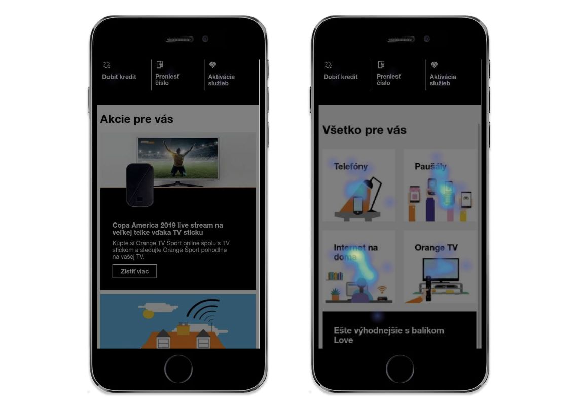
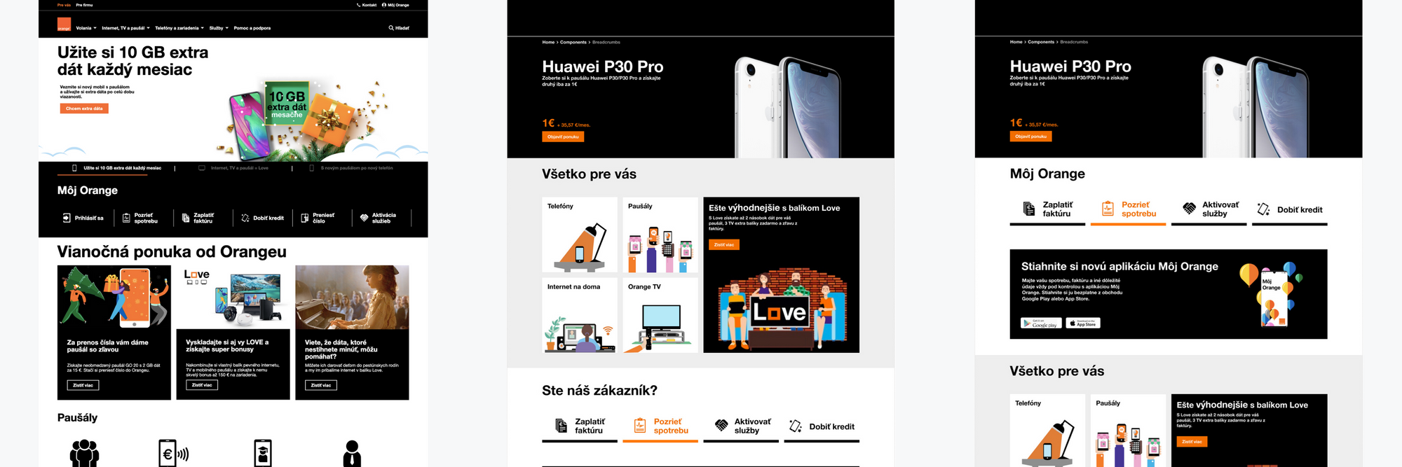
One of our hypotheses was that if we made the navigation easier for the visitors directly from the homepage, the click-rate would improve. So we designed categories with fast links depending on the segment the user was representing.
- In a case of a potential customers (not registered nor logged in) we pointed out phones, voice plans, internet, TV and bundles as those were the most visited subpages via navigation.
- And for the existing customers, we also added quick links to the most visited sections of the private “My Orange” zone.
Minimum viable experiment
From the very beginning of the project we were aware of a lack of dev capacities. That made us look for solutions allowing us to run quick experiments without a need to code new components. We chose a marketing automation tool Exponea which we had previously used for minor design tests.
Having a front-end developer in our multidisciplinary team helped us prepare required components quite easily and we only had to wait for back-end to deploy the tool. All in all, the delivery took 3 days instead of weeks that hard coding might have consumed.
To craft the experiment, we used our validation handbook. There are clear steps from creating an hypothesis to launching an experiment. You can find two canvas, as well as a tool that helps you pick the right type of experiment.
A slider or a hero banner?
Another hypothesis we wanted to validate, was our assumption that visitors just ignore the slider. Either because it rotates too fast or it doesn’t address their needs, the reasons may vary. We decided to run an A/B test (which is just one of many experiments in our Experiment toolbox handout) that would compare the dynamic banners to the static one and also test if personalizing the message works better.
To see this content on our site, you need to agree to usage of 3rd party cookies. Or you can follow a link that will redirect you to following address: https://www.youtube.com/watch?v=cIVG06Xc8es
As it was difficult to customize the message for the non registered visitors, we ran the test only with the customers that are logged in the page. We showed a slider with three banners to half the users and half of them were shown a static hero banner – which was just the same as the first banner in the slider. Its main CTA was prolonging of a voice plan to get a discount for a new phone.
It took only a couple days and we started noticing a massive difference in data. And after two weeks of running the experiment the results were clear. While the interaction with the first of the dynamic banners was 1422 clicks, the second and the third with just about 200 clicks each were not even being noticed. On the other hand, when the first banner was shown as a single static hero banner, it earned exactly 2288 clicks during the same period of time.
Quick wins in a few days
The main win for our team was the ability to run the lean test in just a few days. Exponea lets us shorten the delivery to the minimal amount of time and helps us make quick decisions about features or components we are considering without an urge of having to develop difficult solutions.
For the first time in the Slovak market we tested the performance of banners. The dynamic slider has a significantly lower performance in every aspect and it’s much more efficient to use one personalized static banner instead of many non addressing campaign visuals. Needless to say the navigation of sliders is always somehow questionable.
And last but not least, the experiment helped us match the content of the homepage with what the customers were really looking for. The click-through rate from the homepage grew slowly on desktop but the mobile version showed significant difference immediately. As we saw on the Hotjar heatmaps, users didn’t have to click to the navigation or a search bar any more.