Bringing e-book reading to the Slovak market
How we introduced the DIBUK e-readers to the market for Telekom

In short
- Services
- Product design
- Industry
- Telecommunication
- Capabilities
- User experience
About the project
E-books represent an ecological, practical and cost-effective alternative to the classic paper books. But until recently, for those seeking for Slovak content, paper books remained the only option. That's why Telekom, a subsidiary company of Deutsche Telekom AG, asked us for help with development of a localized e-reader together with an online ordering platform that would power its content.
Challenge
How to bring electronic reading to Slovakia and attract a wide market of book enthusiasts including families and elderly people.
Solution
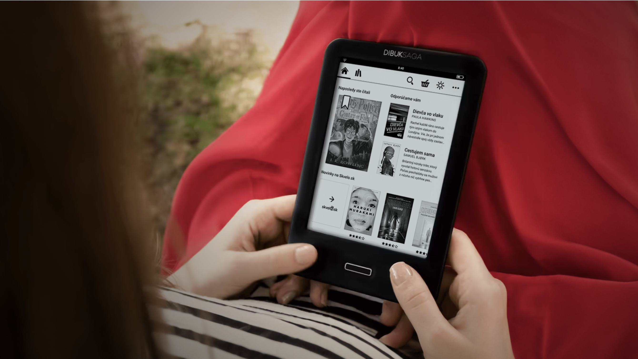
E-book reader Dibuk Saga allows users to read, purchase and gift localised e-books thanks to a simple user interface and powerful features.

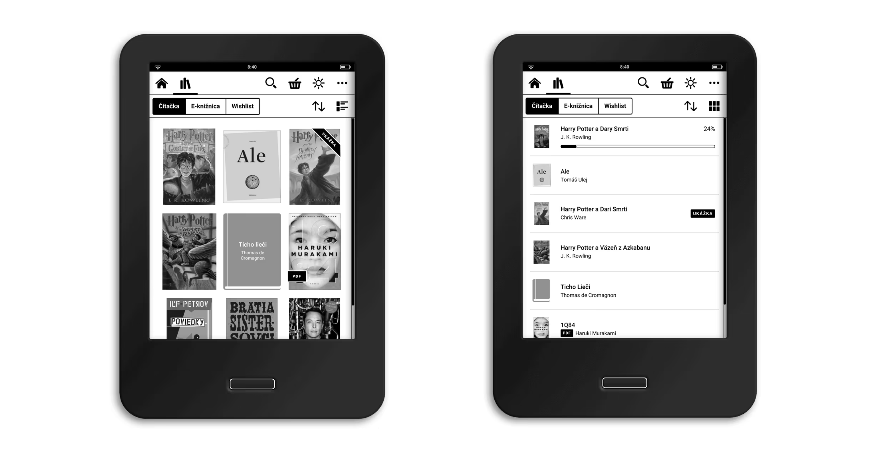
Library is designed for both grid and list view
Minimum Viable Product
Together with the client, we decided to release a Minimum Viable Product with just basic functionality very early on, just two months after the project launch. This way, we were able to immediately received feedback from real consumer usage which inspired us to continue working on version 2.0. Thanks to this live feedback, we could improve not just usability, but added a lot of additional features that mirrored the local market needs.

E-ink technology
The E-ink display behaves like a classic paper page - it allows great readability from any angle and even in direct sunlight. However, the interactions with the display can be difficult for the users. This may be caused by slow rendering, low control precision, and occasional display errors. To minimize the impact of e-ink technology on usability, we optimized the whole interface, typography, icons, and interaction elements.
Readers can choose from six optional fonts, including a typeface for dyslectics. It optimizes letter thickness and distance between letters or words, allowing dyslexics to read easier and with less effort. Our main criteria when choosing the right fonts were flexibility, readability and the typefaces should include different alphabets.

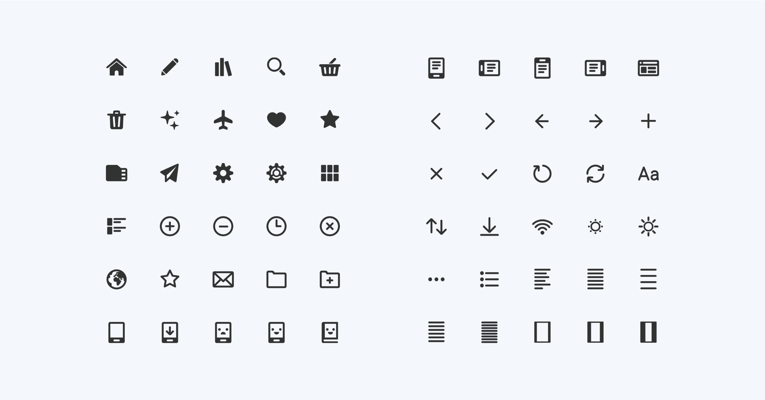
Icons were purposely simple to limit impact on readability, caused by ghost after refreshing e-ink display
Simple, yet powerful
Thanks to simple and minimalistic design, even the first version of the e-reader was very well accepted by the customers, even by the less technologically experienced individuals. However, the product attracted technology enthusiast, too, and they found the lack of some features disappointing. Hence we implemented many of these features in the second iteration and we placed them into special settings. This way the interface remained clear, but allowed more expert use and options for personalization.
Want to know more?
We are here for you
Our expert Marek will provide you with a broader context, and together we will figure out which digital product will help kickstart your business.
Get in touch with Marek
Don’t miss out on
our newsletter

